Comparison of different data sources: ECDC, WHO and OWID
In this document we want to compare the data for daily confirmed infections and deaths of the following three organizations. As one of the sources, the ECDC, stopped providing daily numbers we compare the data between 1.1.2020 and 14.12.2020. To help you verifying the data for your preferred countries we published a Jupyter Notebook named DataSourceComparison.ipynb that you can download in source code from our Covid-19 analysis repository on GitHub.
- World Health Organization (WHO)
The WHO publishes the data on a dashboard available on the WHO Covid-19 pages. As it is an official source we expect the data to be pretty clean and up-to-date. The data can be downloaded here.
- European Centre for Disease Prevention and Control (ECDC)
As the ECDC is an organization of the European Union we can also expect clean and actual data. The data can be downloaded here. Since 14.12.2020 they publish only weekly numbers.
- Our World in Data (OWID)
According to the OWID website the Covid-19 data provided is coming from the COVID-19 Data Repository by the Center for Systems Science
and Engineering (CSSE) at Johns Hopkins University (JHU). The data can be downloaded here.
Some general remarks#
The WHO data covers most of the countries of the world. Even the smallest island in the south east pacific is covered. Unfortunately Taiwan is not covered in the WHO data. Instead Taiwan’s numbers are now included in those of China. It’s a pity and makes the life not easier for the people in Taiwan.
The sources, a Jupyter Notebook, that were used are available in the GitHub repository. In the following we will take a look to the different data for selected countries. You may want to use the Jupyter Notebook to test your countries of interest.
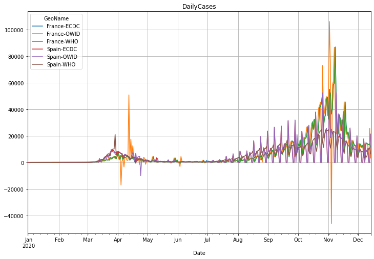
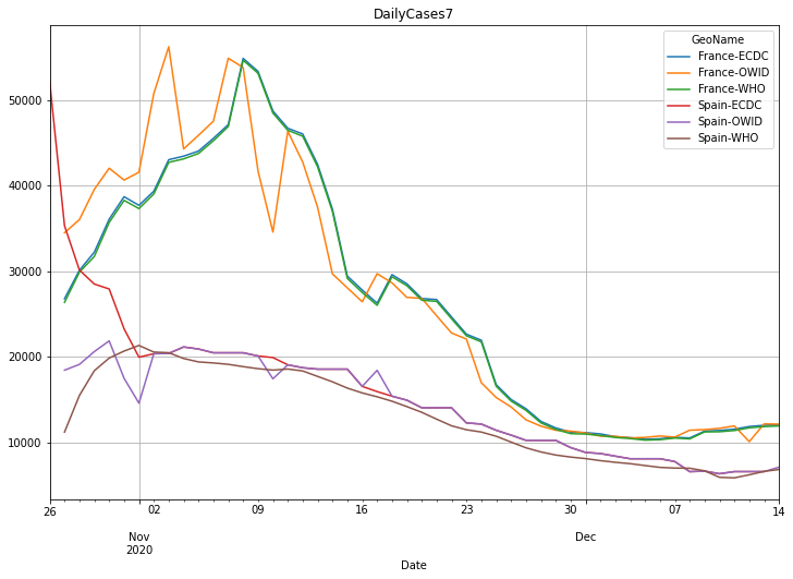
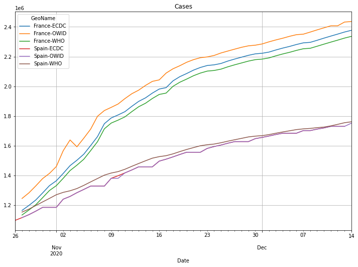
France and Spain#
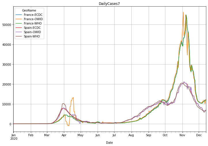
We notice, that the daily OWID data for Spain and France is very noisy. Obviously this is not only the weekend effect. There are also many
corrections in the OWID data. Even by applying a rolling 7-day average we can still see a stronger noise on the OWID data.
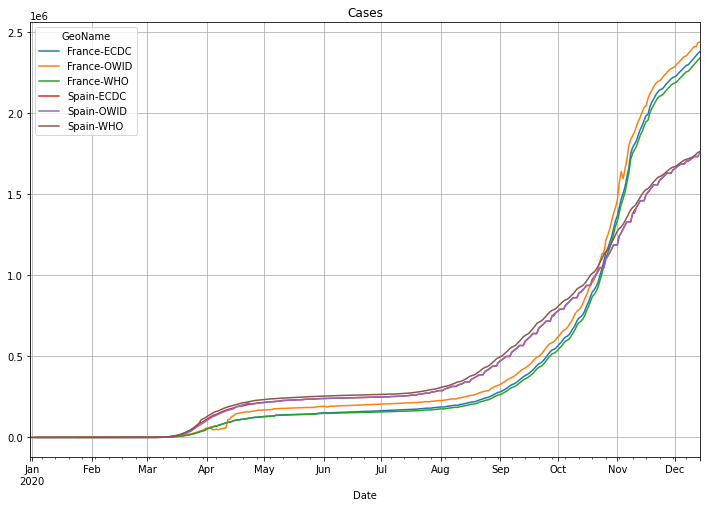
On the other hand the ECDC data is not visible at all as it’s obviously covered by the WHO line. For France we can also see, that the accumulated OWID data is slightly higher compared to the ECDC and WHO.
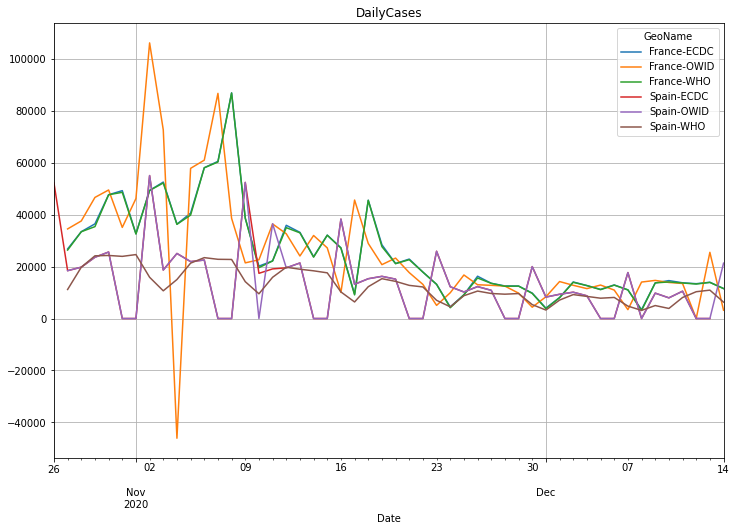
Let’s take a closer look to the last 49 days to see more of the difference in the data. This time we will see a slightly difference in the ECDC and WHO data and the up and down curve using the OWID data even in the accumulated data:
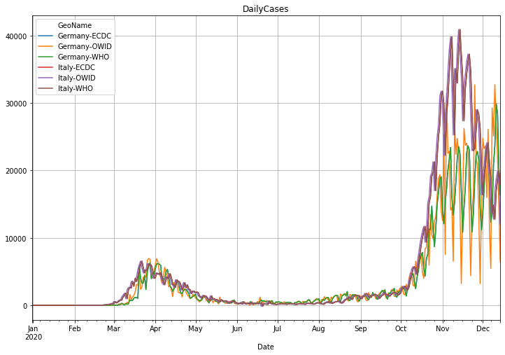
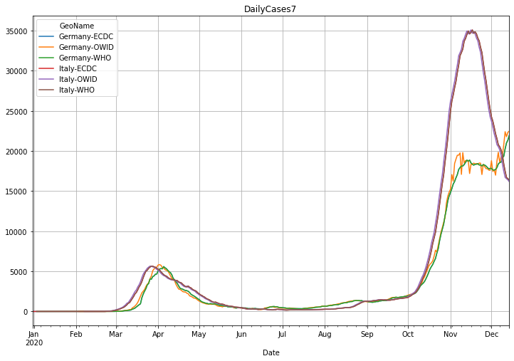
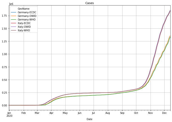
Germany and Italy#
Let’s change the countries to Italy and Germany to see a strange behavior. While the OVID data for Germany is again very noisy with ECDC and WHO being more or less identically, the data for Italy is more or less the same for all three sources.
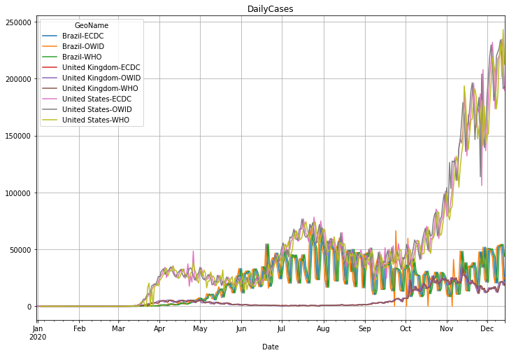
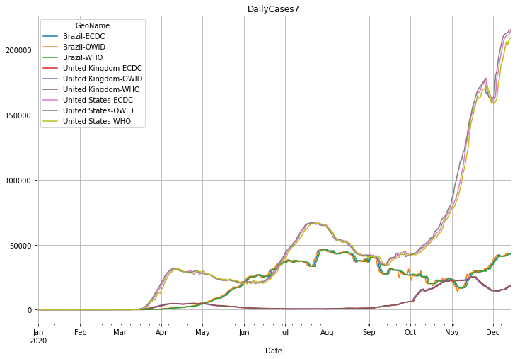
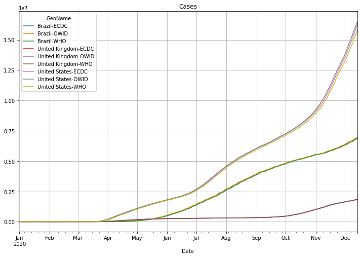
Unites States, Brasil and the United Kingdom#
For the US, Brasil and United Kingdom data we will notice that the United Kingdom data is obviously the same for all data sources and that the OWID data is again noisy especially for Brasil.
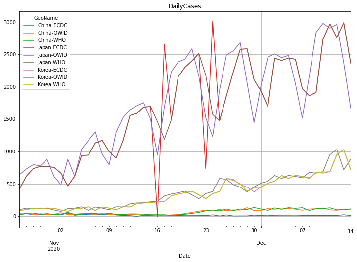
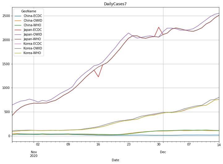
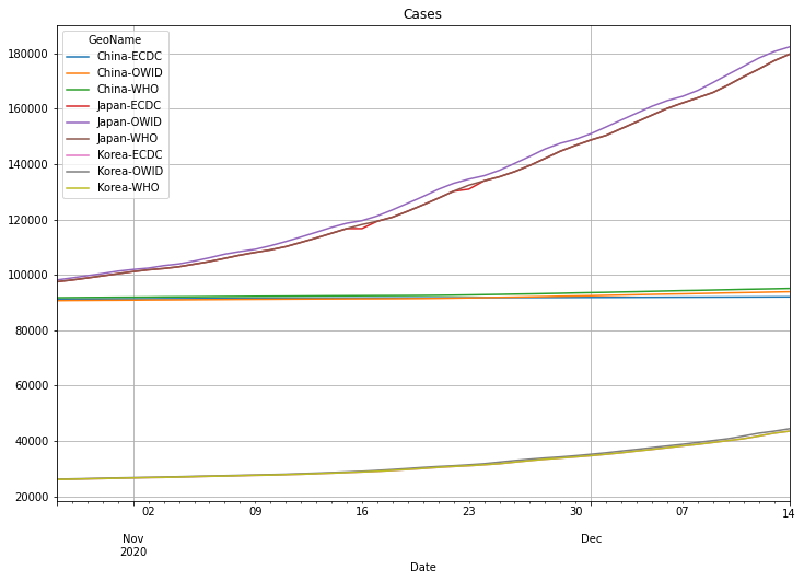
Japan, Korea and China#
For Japan we notice a bigger noise in the ECDC data. For Korea the data is more or less the same and the ECDC and WHO data is almost identical, but slightly shifted by some days. In contrast to the other two sources the WHO does not report recent numbers for China.
Conclusion#
If you are just looking to one country you can use any of the data sources. But the quality of the sources is very different. As soon as you want to compare different countries or do some calculations on the data such as calculating the incidence, doubling time or reproduction number R you need clean data instead of noisy data. Therefore you should avoid using the OWID respectively their source JHU data. The JHU GitHub site refers to many data sources and claims to make use of ECDC, WHO and other aggregated data sources, but in fact it seems that the long list of the Non-US data sources are the main source for the published data.
For Germany they list the Berliner Morgenpost newspaper as a source but that website refers back to JHU. This is not really transparent and it’s difficult to understand why such a reputable university does not use more trustable sources. There was an interesting article about this available here (German language). The article tracked the source of the data and ended up in a company named Risklayer in Karlsruhe, Germany. This company is somehow link to the Funke Media Groupe and uses 40 freelancer that work on a list of local data sources to compile numbers for Germany. They claim to be faster as the official source, the Robert Koch Institut (RKI). That might be true, but the RKI numbers do not show such a huge weekend effect and have much smoother data. The responsible German organizations obviously work at least partly on weekends. The RKI also publish the data always on the same time every day while the JHU data is constantly updated during the day. By doing so they make the data also useless for processing. Taking the data at a specific time is essential for calculations. Consider you want to compare the temperature at different but nearby locations and one is using the temperature at 6:00 and another at 12:00. It will simply not work and this is what we see in the JHU / OWID data for some countries.